3 steps to create a good landing page 

For a good landing page, take these 3 key steps:

  • Attract: optimise your landing page for search engines (they bring more than half of web traffic) 
  • Engage: produce content for your visitor with a unique Call To Action (CTA)
  • Convert: create accessible forms and manage data easily and legally

And don’t forget, once converted, retention is easier than acquisition.


How to make sure your landing page appears in Google, Bing, Duckduckgo…

Time required: 3-5 minutes
Level of expertise: ⭐⭐⭐


  • A meaningful page <title>

You rarely notice the <title> of the page. It appears in the blue bar of the browser and it's the first thing search engines look at. Make sure valuable keywords are listed in your page title.


Avoid generic page titles like Home or Contact.


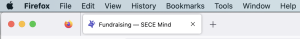
Here's an example from a UK charity:


They thought about what a user could search for and added several keywords in the title.


An example of a good title: Volunteer for Lancashire Mind - it includes action, location, and brand.


  • Use keywords in your copy carefully
    Use your keywords in a readable way; remember you write for visitors not for Google.

    Use 1-3 keywords in the introduction and repeat them on the page but no more than 5 times (else Google penalises your page for “keyword stuffing”)


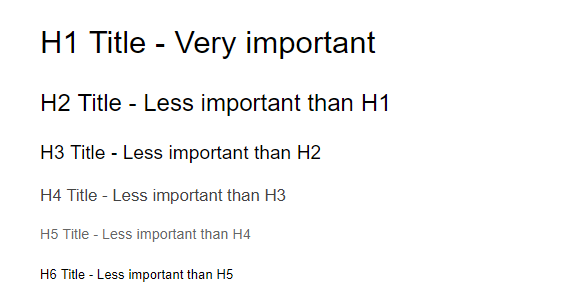
  • Heading tags H1 H2 H3
    Heading tags are a crucial ranking factor. But you can only use one <H1> main title per page followed by H2-H6


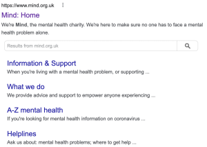
Go a step further: write a short description of the page.
The description is not used by search engines for ranking, however it appears under your name in Google.
A good description will increase the number of clicks to your local Mind hence increasing your Google ranking.


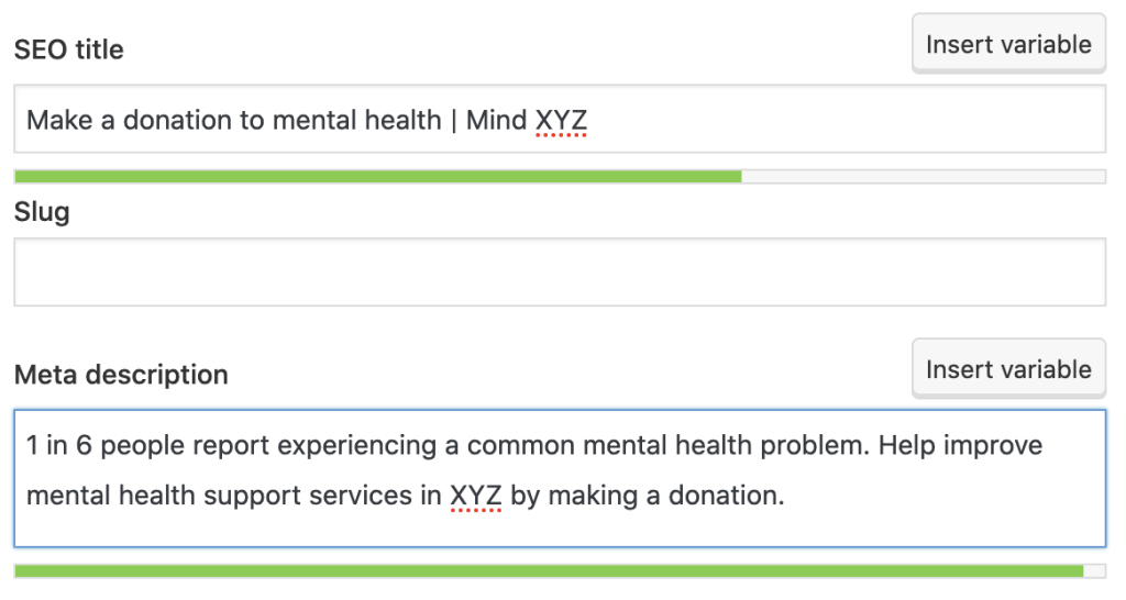
If your website is using WordPress, you can install the free plugin Yoast to customise the page title and description of your page.


Do you need more help with SEO? Please contact [add contact]


How to make sure users stay on your web page (then convert)

Time required: 30-60+ minutes
Level of expertise: ⭐⭐⭐⭐

Remember that a visitor stays on average 2 minutes on a page. To grab their attention you need a few elements (and a user-centered mindset). It's not as easy and there is no magic wand.
There are best practice tips we summarised here.


  • Hero image - The image at the top of the page (not sure why it's called a hero image)

The photo must be .jpg or .png and compressed (a web resolution = 72dpi and a file size of maximum 100kbs) to ensure it loads quickly on the page and is seen first, including from visitors on a mobile on an average 4G.
The file name is important for search engines (especially Google Images). Rename files like IMG_1983.JPG => RunForNewportMind.jpg
If your CMS template allows it, a short text introduction could be added over the image but make sure it is still readable on a mobile.


A good use of a hero image by Lancashire Mind
The text is legible on all devices


Whenever possible, use a real photo or a photo from Mind image library [LINK?].
Avoid Stock photography!

imagine this!


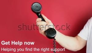
Don't forget to add a description of your image ALT tag. This is essential for accessibility.


The copy - a few rules

  • Keep it short
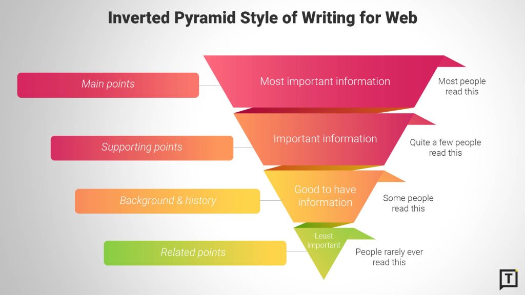
    Most people quickly scan the page and, although search engine algorithms are secret, it is understood they don't scan the whole page if it's too long.
    We often talk about the "inverted pyramid concept": start with what is important then move to more information.


  • Make it personal (Write for one visitor not for many)
    Your visitor is alone with her/his/their screen. Keep the copy personal with a similar tone you use on social media

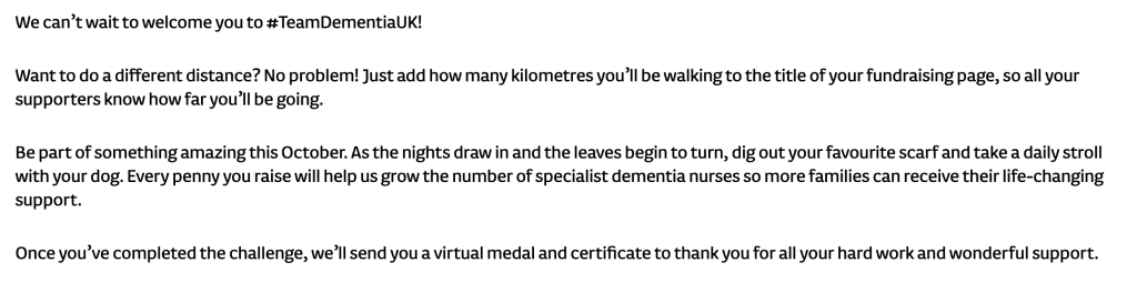
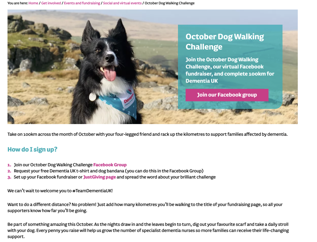
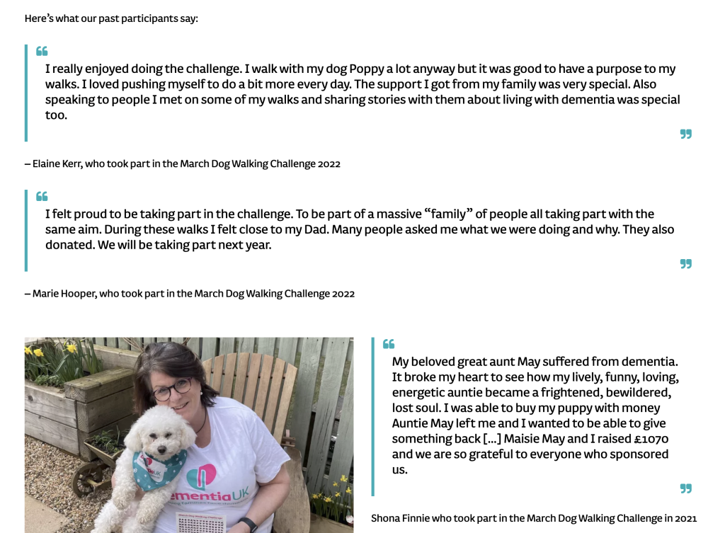
Example: Dementia UK Dog Walking Challenge


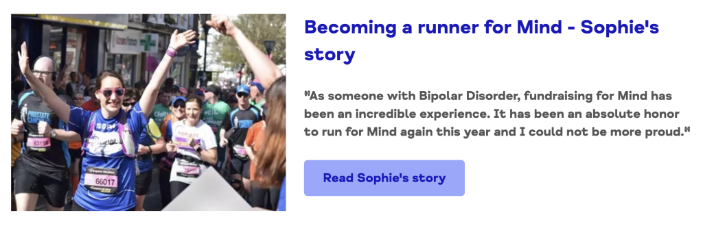
  • Use quotes or testimonials
    People like doing what others do and being part of a 'movement'


Example: Mind - Tough Mudder
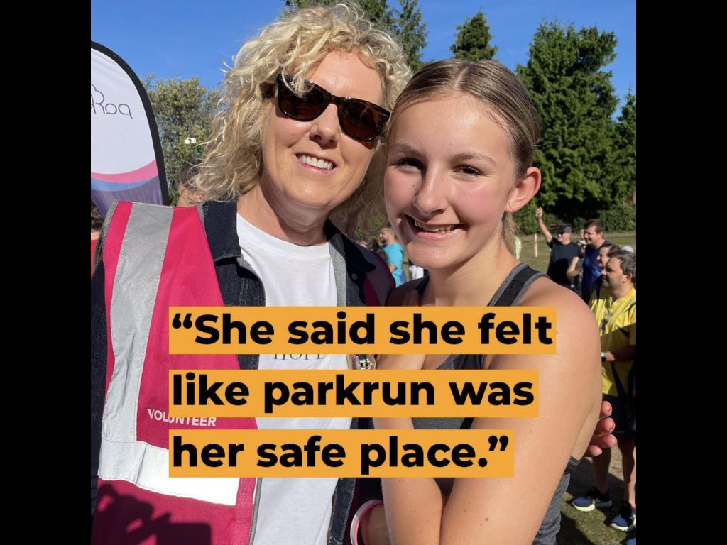
 

Example: Parkrun


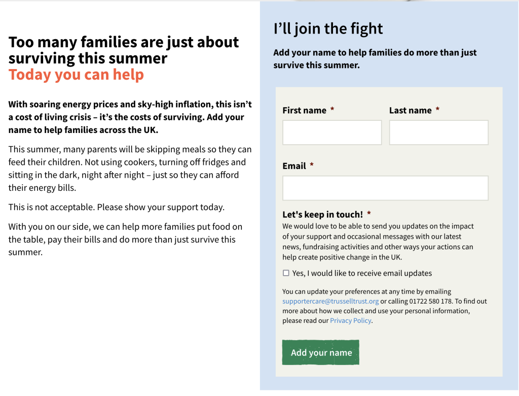
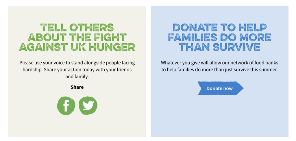
  • Have one call to action
    Remember your visitor scans the page (over 50% on a mobile or tablet).
    Try to limit the ask to just one. But you can repeat it on the page.
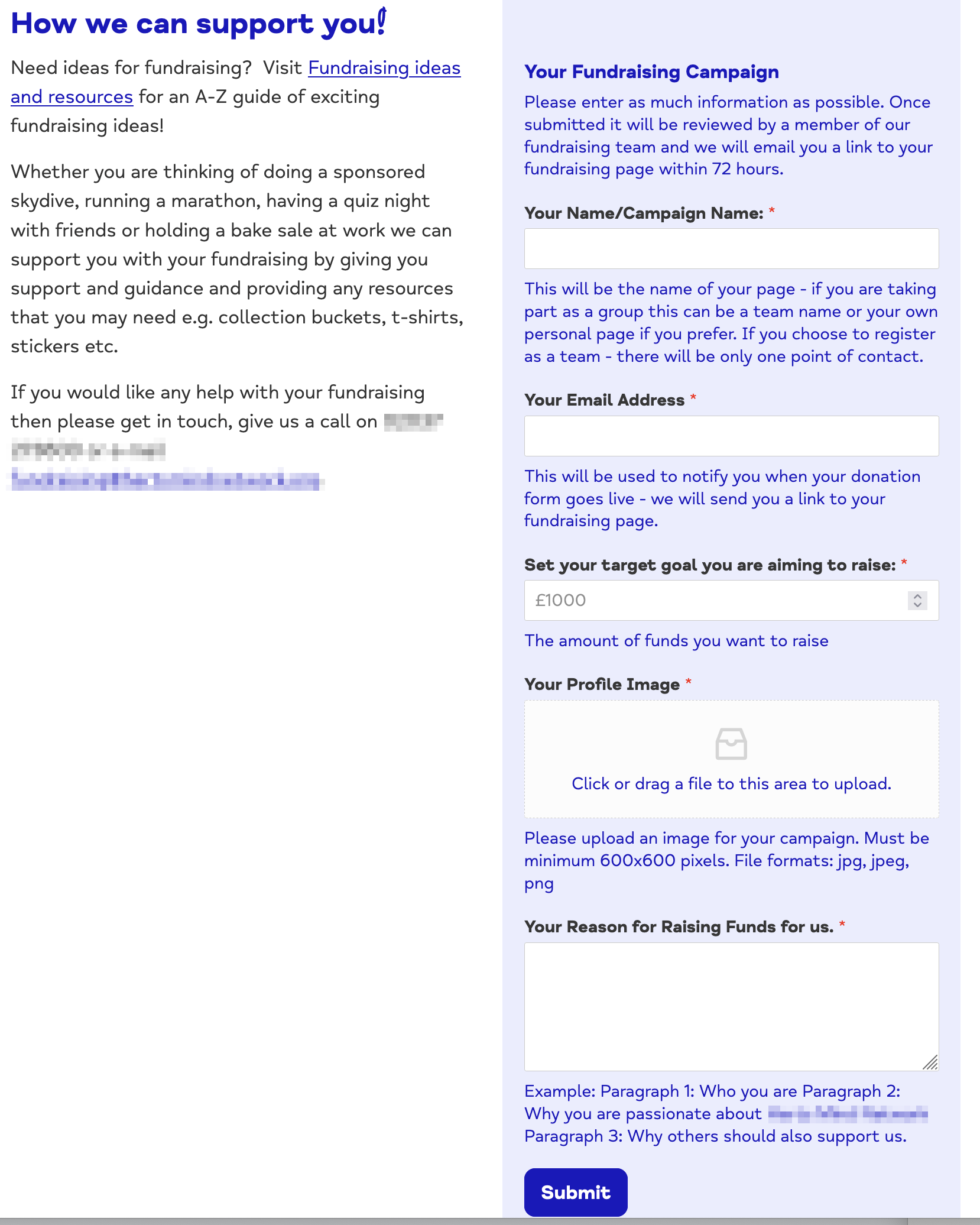
    It can be: leave your email (to get more information), your number (for a call back / Whatsapp message), or fill a form (see below)


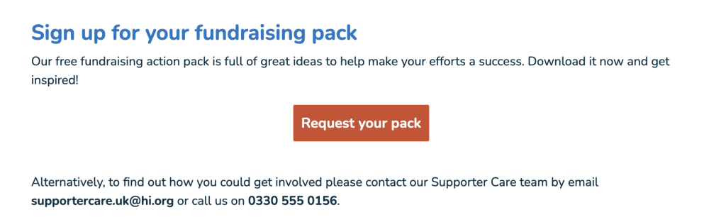
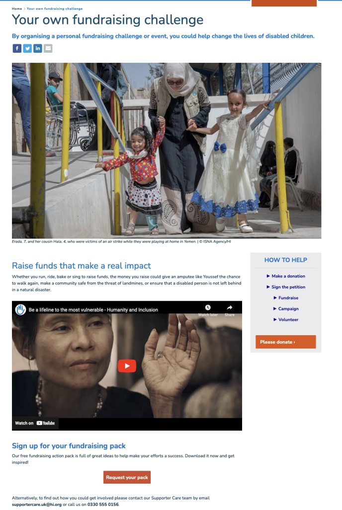
Example: Humanity & Inclusion - Fundraising pack (request form not just a PDF link!)


  • Keep the page up-to-date
    Looking at an event with a past date you can't register to is annoying. After the event, update the page with photos and a call to action to register (or learn more) for next year's event.


Do you need more help with content production? Please contact [add contact]


Before we talk about conversion and forms, let's look at a few examples of landing pages.


Dementia UK - October Dog Walking Challenge


Good practice

  • Brilliant hero photo (with clever branding)
  • Overlay copy is describes the event with Call To Action
  • Clear instructions to take part
  • Copy written for indiviudals

Could be improved

  • One or two quotes would have been enough or...
  • A video from previous event with testimonials

Humanity & Inclusion UK - Fundraising landing page


Good practice

  • Keyword in page title"Fundraising Challenge | Fundraising Ideas | Humanity & Inclusion UK"
  • Description for search engines "Claim your free fundraising action pack today! Full of great fundraising ideas from personal fundraising challenges to fundraising events."
  • Use of header <h1>
  • More keywords (challenge or event) in the introduction
  • Explains the impact of donations
  • Single call to action

Could be improved

  • Photo of beneficiary is impactful but a photo of a supporter taking part in a challenge or event would be more engaging.
  • The photos was updated but not the copy that mentions a child that is not connected to the photo or the video.  (I emailed them about this mistake)

Changing Faces - Kiltwalk event


Good practice

  • Summary of page content
  • Engaging quote
  • Short and engaging copy
    "Grab your walking shoes, dust off your best tartan and fundraise for us. You’ll receive a free Changing Faces T-shirt to wear with pride."
  • Link to a longer story / testimonial with inspirational content

Could be improved

  • Photo montage could be a photo gallery
  • Call to action is email not a form. It could be more practical for a visitor but restricts ways to engage (GDPR)

Engineers without Borders UK - registration landing page


Good practice

  • Hero banner with photos of targeted audience
  • Call to action on banner
  • Short copy with more information (benefits)
  • More information video and paragraph 

A perfect use of the inverted pyramid


How to create forms that convert

Time required: 60+ minutes
Level of expertise: ⭐⭐⭐⭐⭐

The design of the form is not complex but the challenges are:

  • Variety of forms you might need: from a simple email capture form to an event registration with a need for date of birth, size etc.
  • Managing data: transfer from the website form to your internal database/CRM/Spreadsheet
  • GDPR compliance


It's difficult to cover all types of forms but there is a simple rule: only ask for data you REALLY need.

The form is the first acquisition step don't neglect the thank you page and email confirmation.


If you need more help with forms? Please contact [add contact]


Let's look at a few examples. 


Confirmation / Thank you page

Trussel Trust - Email acquisition


Good practice

  • Essential fields only (no Title: Ms/Mr/Mrs...)
  • Contact details of the team
  • Button repeating the call to action
  • Thank you page with ask to share or donate

Could be improved

  • Impossible to complete the form without ticking the email permission. Could be simplified with a statement.
  • Copy mentions "this summer" and should be updated with the correct season


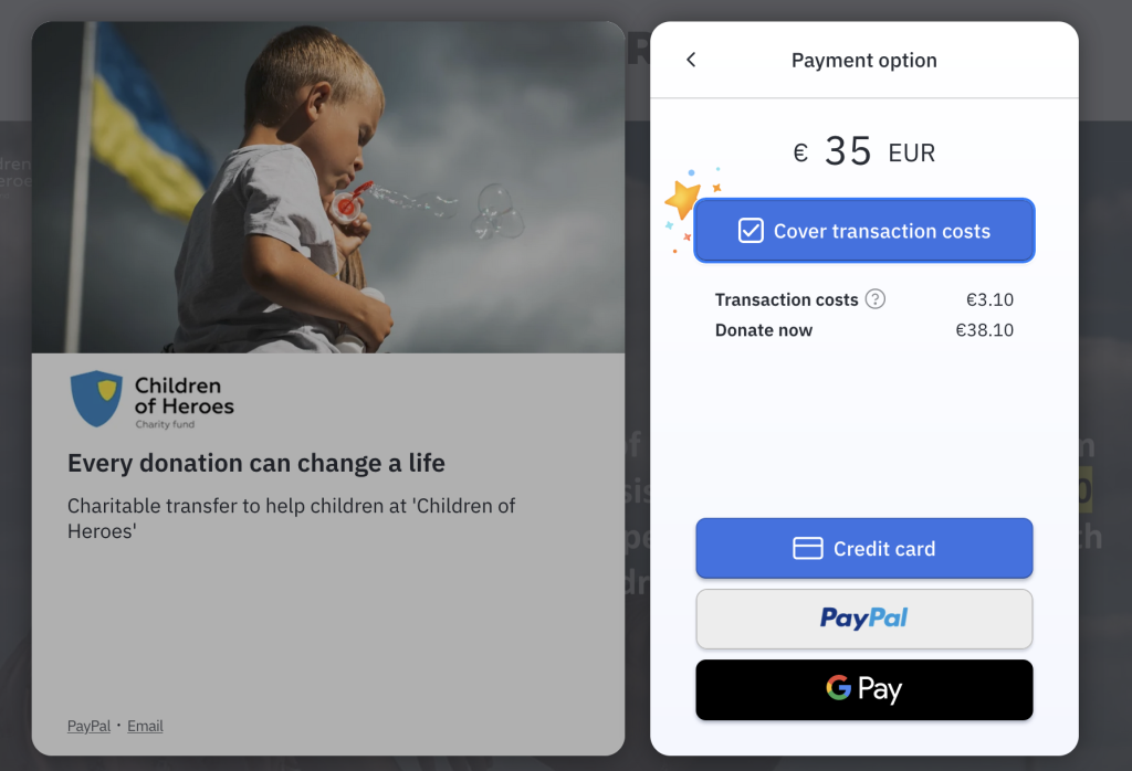
Children of Heroes - donation form


Using donation system Fundraise Up


Good practice

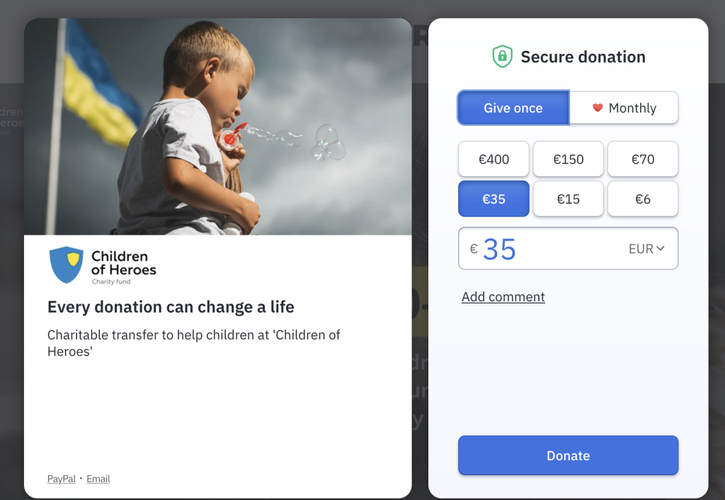
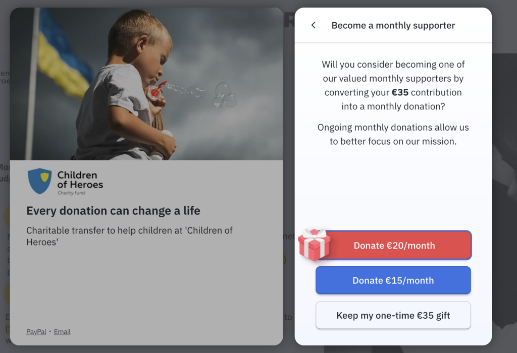
  • Donation form on top of web page (no need to leave the site)
  • Prompt to change single gift to regular donation
  • Suggestion to cover transaction fees (85% do)
  • Option for mobile payment
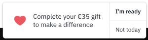
  • Prompt to complete transaction (if not completed) at the next visit

Service - Enquiry form


Good practice

  • Essential fields only (no Title: Ms/Mr/Mrs...)
  • Easy to complete


Could be improved

  • Could add a photo or quote on the empty space
  • Could change "Message" to "Tell us about more about yourself" or "how can we help you?"
  • Could make the button more user friendly: "get more information" instead of "submit"
  • The colour could be more contrasted, grey on grey is hard to read (not fully accessible)
  • The use of reCaptcha "I'm not a robot" can impact on conversion. Only use it if you are getting a lot of spam messages

Fundraising form


Good practice

  • Engaging copy with suggestions
  • Essential fields in the form with explanations and next steps


Could be improved

  • A montage of example of events would make the paragraph less text heavy
  • The profile image is a required field and might prevent some users from filling the form because they may not understand what "600x600 pixels. File formats: jpg, jpeg, png" means or because they haven't got the photo yet. It would be better to ask them for this information once their page is confirmed
  • The "submit" button could be change to "join us" or "start fundraising"


Checklist


My page Title has keywords

I have used a <H1> tag with important words

I have used other tags <h2>-<h6>

I have not repeated my keywords more than 5 times


My images are optimised for a quick download

I produced a content that sounds personal

I made it as short as possible

I used a quote

I have a clear call to action


My form only has fields I really need

I tested the form... and it works

I know where the data goes and it's GDPR compliant

I have created an engaging thank you page